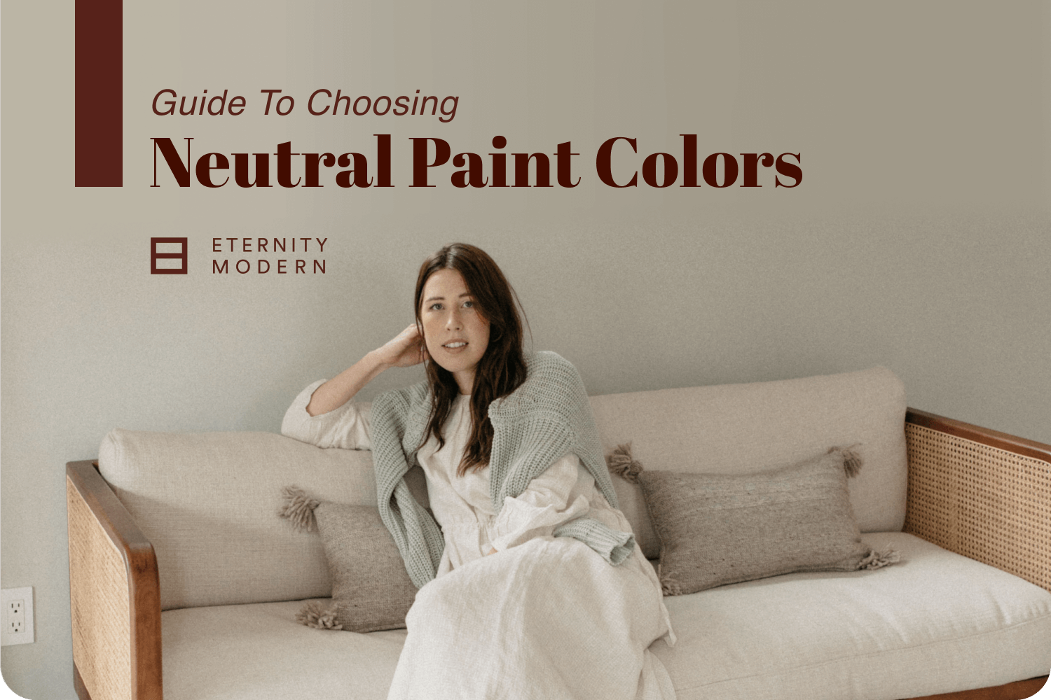
Neutral paint is the go-to choice for painting interior walls. For living in your house, it brings home a natural feel to your decor and for selling a house, neutral walls increase your sales success.
Understanding what a neutral color is and how it works in your room’s neutral color scheme will help you choose the right color for your environment. We’re going to take you through three areas in this guide to help you find the best neutral color for your walls.
Neutral colors include beige, ivory, taupe, black, gray, and shades of white. Each of these colors can have underlying tones or hues that will influence how you mix and match colors in your space.
Beige can have undertones of pink, tan, gold, or grey. White can be yellowish, bluish, or peachy-colored.
Let's explore some of the more popular neutral colors.
Beige:
Beige is often the color people will turn to when they're not sure which color to choose. It's a relaxed, uncomplicated earthy color that people feel will go with anything.
Matching beige's undertones and color temperature is a challenge you may not expect. There are 30 different types of beige and finding just the right one can be a headache if you don’t plan for what you want from it.
Beige is popular in office spaces because of its calmness and versatility. It's associated with dependability and productivity. Images of sand, rock, and natural wool come to mind with this neutral color.
Ivory:
Ivory is favored for being warmer than pure bright white and provides a softer feel to your room's atmosphere. We associate this color with elegance and luxury.
Ivory embodies a more naturally-occurring version of white that we find in nature, such as on seashells, pearls, sand, and stone.
Matching ivory with beige often works to create a coastal-inspired ambiance.
Gray:
Gray is one of the most loved colors in interior design. The shade of gray and its undertones determines whether this color warms up or cools down the atmosphere.
Archetype gray refers to the color of gray you get from mixing black and white and nothing else. This gray is more true neutral in tone than the other shades.
A warm gray is created when you mix black, white, and a warm color, such as yellow into it.
A cool gray has a cool color, such as blue, mixed in along with the black and white colors.
Gray is favored for a minimalist ambiance and decor styles more reminiscent of industrial designs. It carries a depth to it while bringing other colors in the room to life.
In 2021, Ultimate Gray and Illuminating Yellow was the Pantone color of the year. Pantone sported the gray and yellow combination as "practical and rock solid but at the same time warming and optimistic."
What about trendy additions like Greige?
Gray plus Beige creates Greige and many homeowners have taken to favoring this neutral color. Together, these two colors combine to create a useful and versatile neutral color.
Greige works in both cool and warm color palettes. If it has more gray, it tends to be a cool neutral, while a greige with more beige is used as a warm neutral.
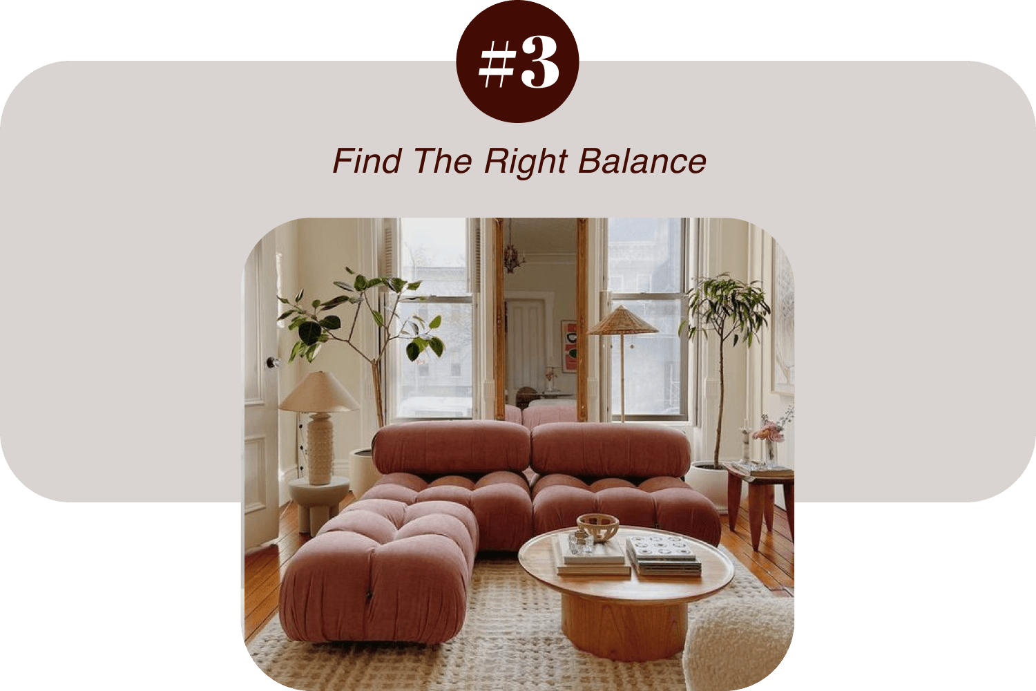
Tip: Layer your neutrals.
For an all-neutral color scheme, layer different hues of the same color.
- Paint your walls lighter and choose darker furniture shades.
- An area rug on wooden floors that is just a shade darker than the wall compliments the color scheme and helps make the furniture stand out.
- If you're carpeting the room, choose a shade darker than the walls.
- Bring it all together with accessories that include the shades you've used on the walls, floor, and furniture.
How much natural light the room receives will help determine how well your color scheme flows together. Darker walls will tend to make a room feel smaller and very dark if there's very little natural light.
Is your room large and light? In this case, you're able to choose from many different options.
You're freer to make your color decision based on your taste and the space itself. You can go for a room that is uniformly neutral or play with contrasting colors and let your furniture steal the spotlight.
White and natural beige work well with rooms full of natural light and provide you with a lot of versatility.
The darker neutrals, such as black and dark gray also provide you with a lot of options.
- You can accent a wall with dark gray or black and use a light neutral color on the rest of the walls.
- Black can add a cozy, dramatic look when it's used to color built-in bookcases.
- Black with a hint of blue pairs well with cool light blue and gray tones.
- Create an almost neutral mood ambiance with a lighter gray featuring blue color tones.
Where is your natural light coming from?
- North-facing rooms receive a cooler, grayer light. Using a warm neutral color will make these rooms feel cozier and more inviting. Creamy greige, light cream, and cool tans work well here.
- South-facing rooms receive warm, yellowish light through the afternoon. Warm taupe, warm gray, or a light, creamy greige are good to experiment with in these rooms.
- East and west-facing rooms get less consistent natural light. Warm colors tend to work better here. Try testing a color with a golden beige hue, the off-whites, or a warm greige with a tiny bit of green hue in these rooms.
Tip: Get color swatches of your favorite colors for your walls and place them in the room. Check them at different times of the day to see how the natural light plays on them.
Is your room small and dark? Then, you'll want to stick to painting your walls a lighter neutral color.
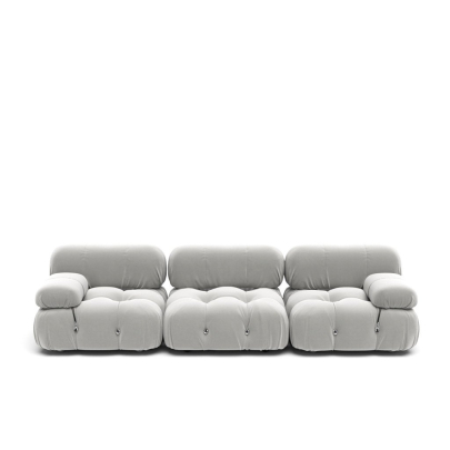
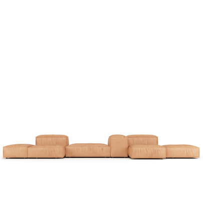
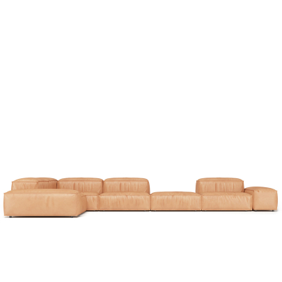
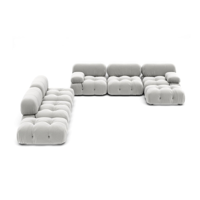
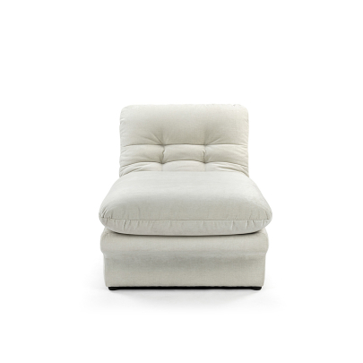
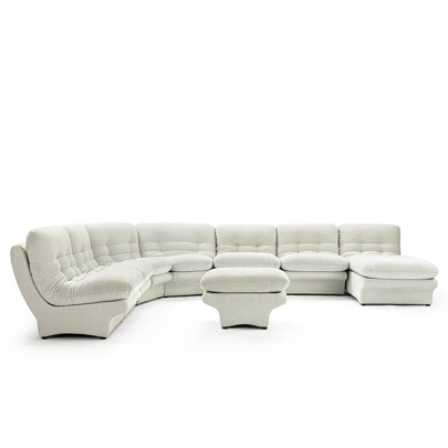
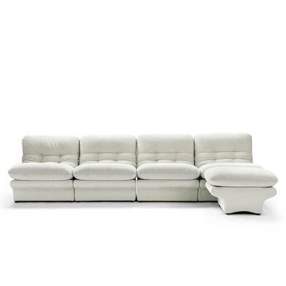
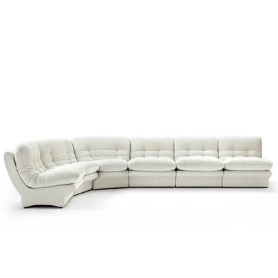
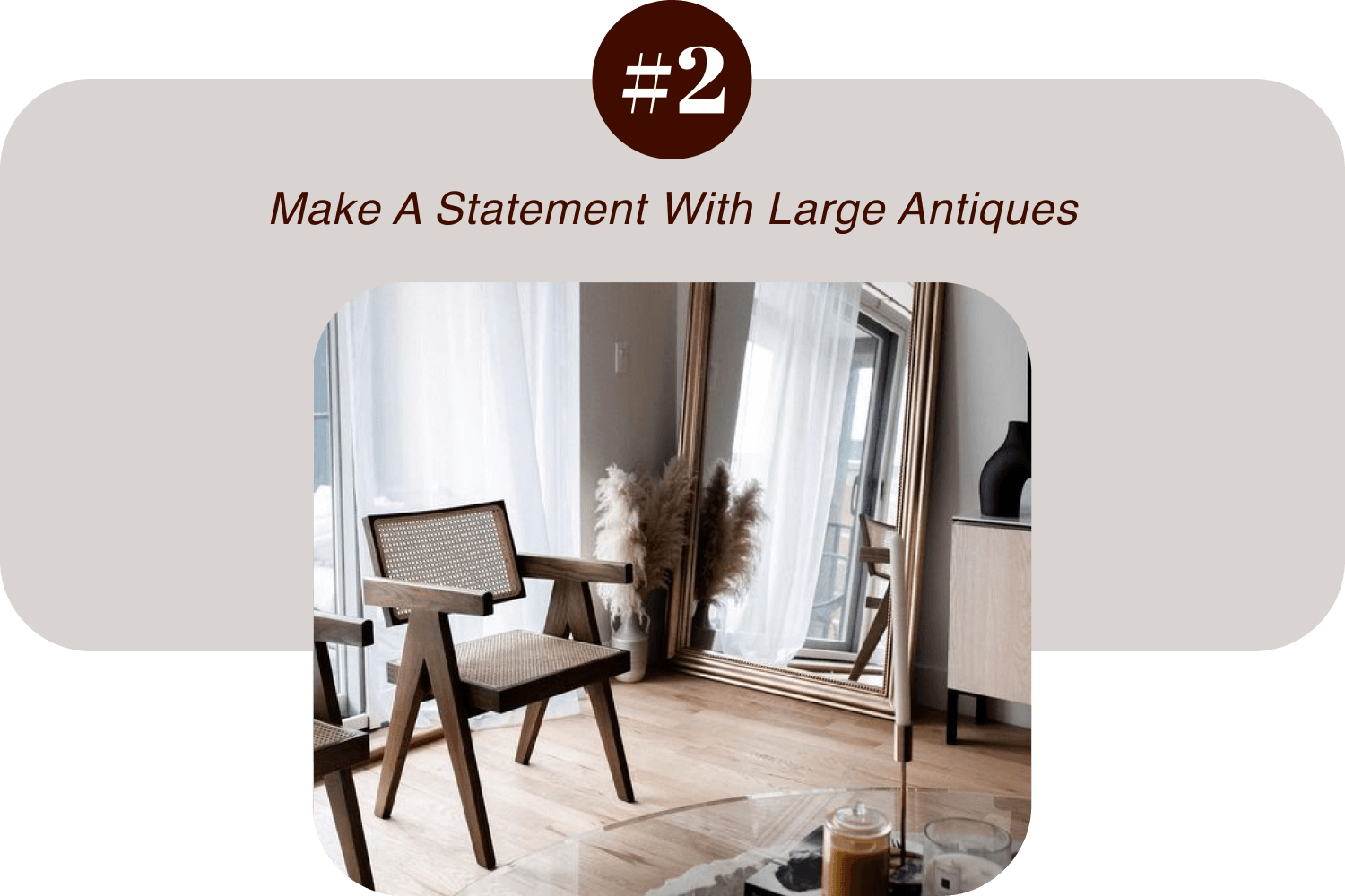
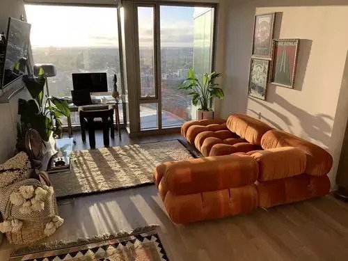
Don't be afraid to let your room's natural light reflect your personality. We love how Alex mixed and matched neutral colors in his living room. The natural light enhances the Mario Bellini Sofa | Combination 009 and creates an inviting space.
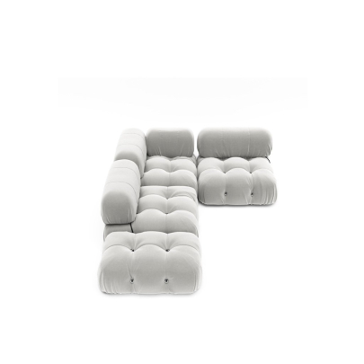
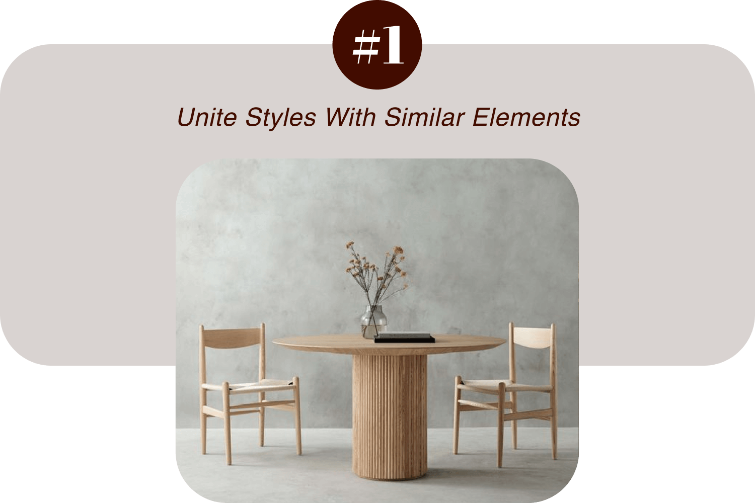
Mix and match textures and patterns throughout your room to create a visually appealing experience and a cozy feel to the space. You'll add personality to your room with depth and eye-catching contrasts.
If you're new to using textures, start small. Add a couple of accent cushions or throws to the Eternity Modern sofa or bed. Style a shelf with textured accessories.
Using furniture with different textured upholstery or materials is a good way to add depth and visual interest to the room.
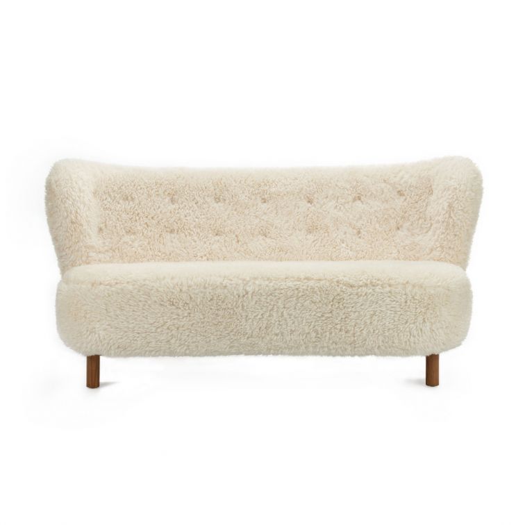
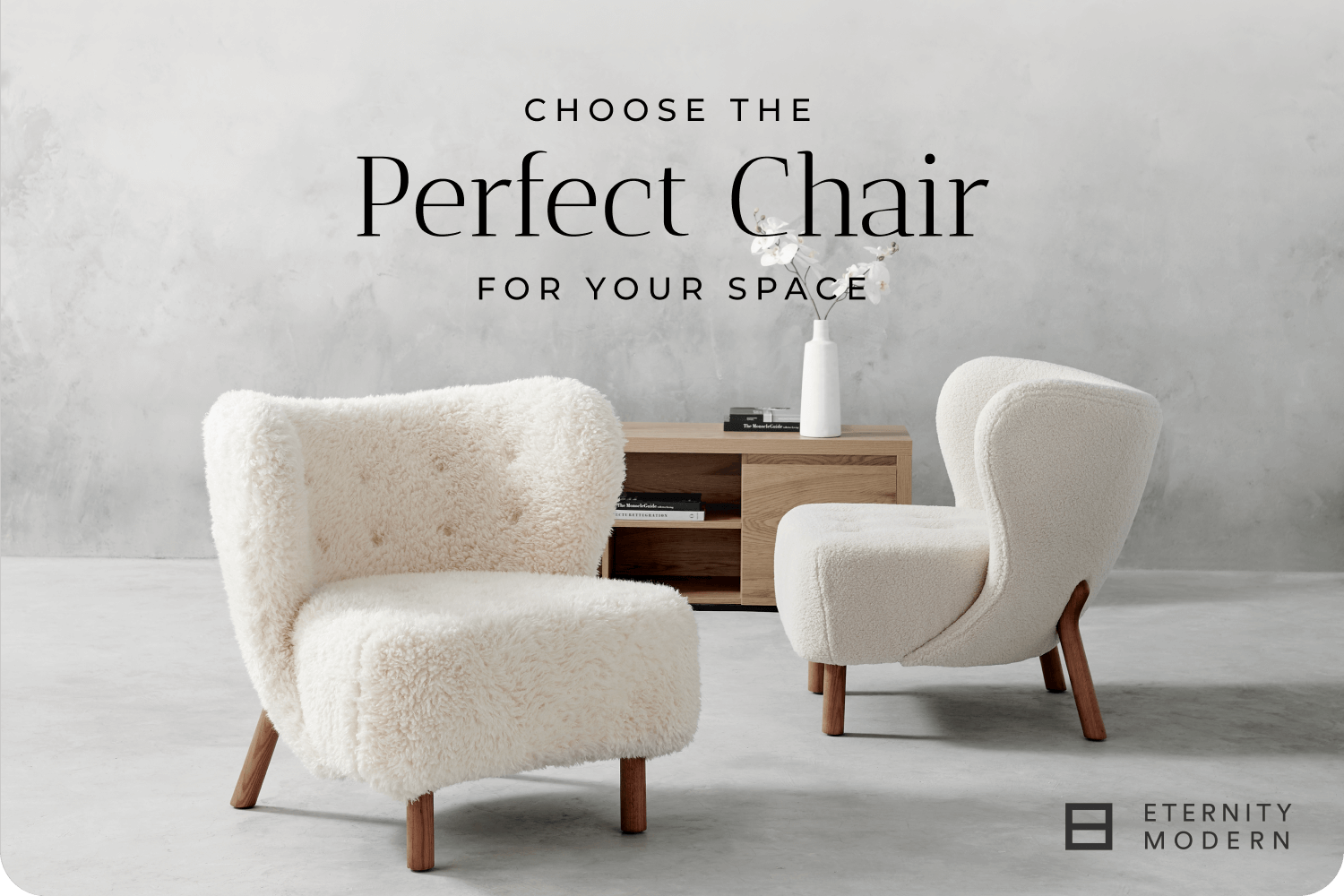
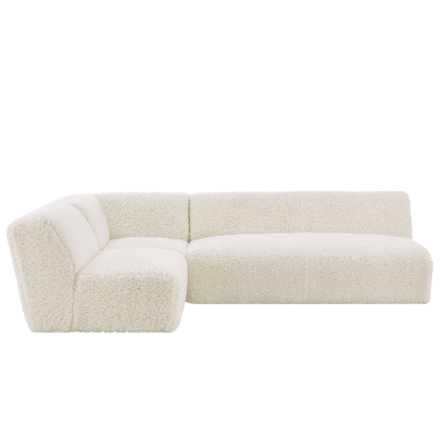
The Little Sherpa Loveseat adds texture and a subtle pattern element to your room. The texture of the wood finish and sheepskin material brings two textures into play while the buttonhole pattern helps this lovely piece fit into your neutral palette scheme.
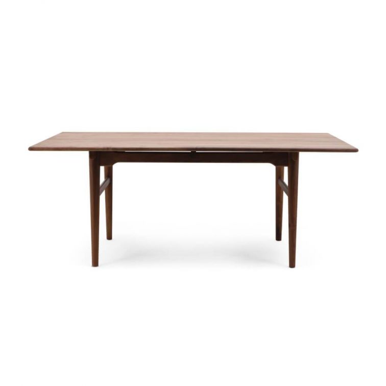
The Hans Wegner Dining Table is available in Natural Ash or Solid American Walnut that perfectly complements your neutral kitchen design. Whether you're going for a light ivory look or a more beach-inspired color scheme, you can't go wrong with this classic look.